

Implementing Dark theme using TailwindCSS in 5 mins

I am a full-stack developer. Building with Go, Typescript, React, Node, PostgreSQL, MongoDB. Here to share my knowledge and journey
Many of us including me, thought that implementing dark theme in any application is a lot of work. But then I learned TailwindCSS, and I found out that TailwindCSS makes implementing a dark theme in your application very easy.
Overview
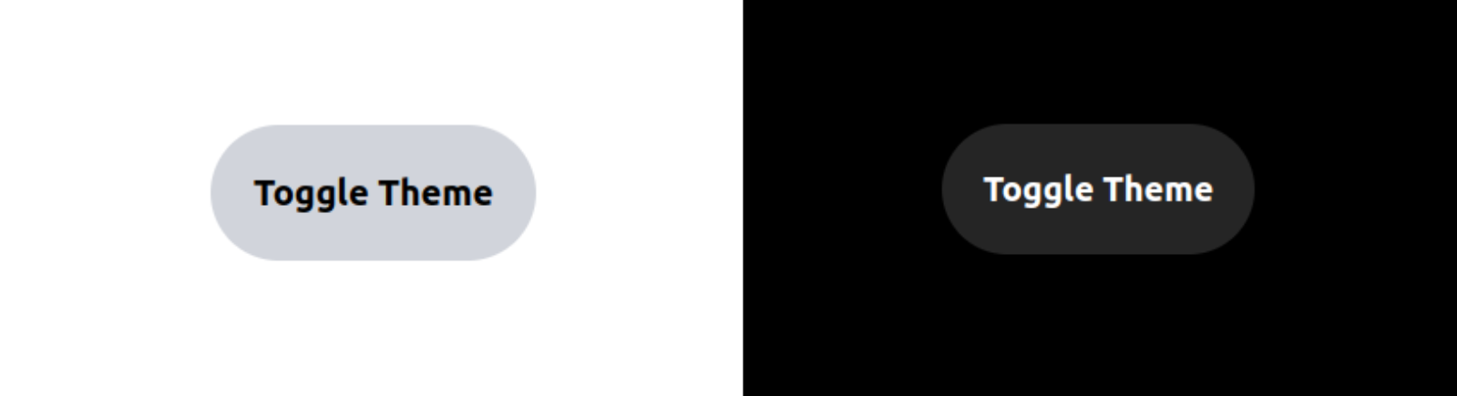
We will build a simple website that has a button that toggles the theme of the website between dark and light theme.
Github repo: https://github.com/yashnirmal/tailwind-dark-mode-demo
Our website will look like this when we toggle the theme
To the code
Make a project and install tailwind in it
I will be using Vite's VanillaJs template for our website. To make a project with Vite's VanillaJs template run the following commands in the terminal
npm create vite@latest dark-theme-demo --template vanillaAfter the template is created go inside the project folder, install dependencies, and run the project in
localhostusing the following commandscd dark-theme-demo npm i npm run devNow change the
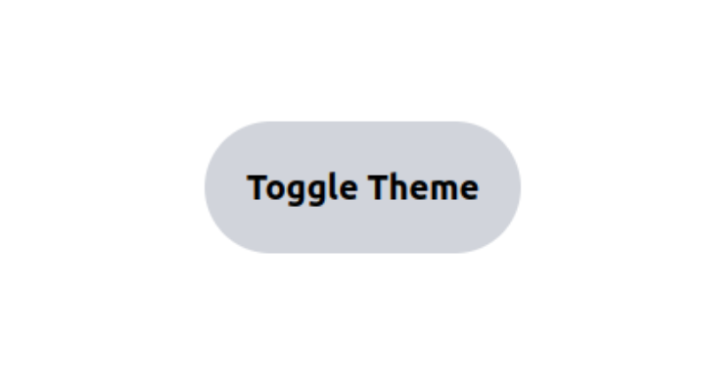
index.htmlfile to add a toggle theme button<!DOCTYPE html> <html lang="en"> <head> <meta charset="UTF-8" /> <link rel="icon" type="image/svg+xml" href="/vite.svg" /> <meta name="viewport" content="width=device-width, initial-scale=1.0" /> <link rel="stylesheet" type="text/css" href="style.css"> <title>Vite App</title> <script src="main.js" defer></script> </head> <body class="w-[100vw] h-[100vh] flex items-center justify-center"> <button class="bg-gray-300 font-bold text-xl p-6 rounded-full"> Toggle Theme </button> </body> </html>Now that our basic project is ready, I will remove the unnecessary files to make it simpler and then install Tailwind. If you know how to install tailwind in the project go to the second step
To install TaiwindCSS in the project, run the following commands
 npm install -D tailwindcss
 npx tailwindcss init
Now add to add tailwind to all the paths on our website, configure the
tailwind.config.jsfile/** @type {import('tailwindcss').Config} */ export default { content: [ "./index.html", "./src/**/*.{js,ts,jsx,tsx}", ], theme: { extend: {}, }, plugins: [] }After this add the tailwind directives in
style.cssto apply the tailwind styling to the website@tailwind base; @tailwind components; @tailwind utilities;Now all the tailwind styles will be applied to our website and it will look like this
Tailwind dark mode basics
To implement the theme-changing functionality we will have to know some basics of Tailwind.
First is the
darkvariant in Tailwind.darkvariant works like other variants likefocusandhover. When the theme is dark the styles in thedarkvariant will be applied.<!-- index.html file --> <body class="w-[100vw] h-[100vh] flex items-center justify-center dark:bg-black"> <button class="bg-gray-300 font-bold text-xl p-6 rounded-full dark:bg-[#252525] dark:text-white"> Toggle Theme </button> </body>In the above code for our
index.htmlfile, I have entered some styles withdarkvariant, that we want on our website when dark mode is enabled.By default dark variant applies the styles based on the theme of your device. So if you have dark theme set on your computer and you open the website,
darkvariant detects the theme in your computer and applies the dark theme.But, we want that the user can manually change the theme of the website for that we will be using something called
classstrategy in the project.To do that we have to add the following configuration in the tailwind.config.js file
 module.exports = {
   darkMode: 'class',
   // ...
 }
Now whenever our
htmltag in ourindex.htmlhave a class named dark, dark theme styles will be applied on the website.<!-- Dark mode enabled --> <html class="dark"> <body> <!-- Will be black --> <div class="bg-white dark:bg-black"> <!-- ... --> </div> </body> </html>Change the main.js to toggle the theme
Now we want that whenever we click on the
Toggle Themebutton, our theme will change. The logic for that will be that if thedarkclass is already present in thehtmltag we will remove it and if thedarkclass is not present on the html tag we will add it.We have implemented the above logic in our
main.jsfileconst toggleBtn = document.querySelector('button') toggleBtn.addEventListener('click',()=>{ if(document.documentElement.classList.contains('dark')){ document.documentElement.classList.remove('dark') }else{ document.documentElement.classList.add('dark') } })Woo hoo! We have implemented the theme changer🥳
Congratulations! You have now implemented the theme changer on your website.
Here are a few resources you can follow:
1. Vite Docs - https://vitejs.dev/guide/
2. Tailwind Docs - https://tailwindcss.com/docs/dark-mode#toggling-dark-mode-manually
3. Github repo for the project - https://github.com/yashnirmal/tailwind-dark-mode-demo
Conclusion
Thank you for being till the end and check out other interesting blogs by me here: https://yashnirmal.hashnode.dev/
And if you got any difficulties or suggestions in this article you can comment them down.


