


We all know that UX plays a significant role in user retention. One way to improve UX is to show the application state updates through toast notifications. And the best library I found so far is Sonner.
It is very easy to use and clean. A few good things I love about this library is
Easy to integrate
Easy to customize
Customization
Handles multiple notifications beautifully
Now, let's see Sonner in action
Integration
npm i sonnerimport './globals.css' import { Toaster } from 'sonner' export default function RootLayout({ children }) { return ( <html lang="en"> <body className={inter.className}>{children}</body> <Toaster /> {/* <--- Add this line to initialize the library in your app */} </html> ) }Showing toasts
To show toast, we can call the toast function provided by Sonner
 "use client";
 import { toast } from 'sonner'

 export default function Home() {
   return (
     <main>
       <button
         onClick={() => {
           toast("Toast Demo!");
         }}
       >
         Show toast
       </button>
     </main>
   )
 }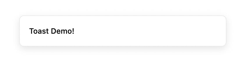
Customization
The best part about Sonner is that it is highly minimalist in design and easily customizable
A. Showing toast with a description
 toast.message('Toast heading', {
   description: 'Toast description here...',
 })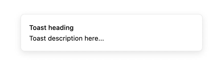
B. Showing color-rich notifications
To show color-rich notifications we can set the property ofrichColorsprops astruein the props during initialization in the root.export default function RootLayout({ children }) { return ( <html lang="en"> <body className={inter.className}>{children}</body> <Toaster richColors /> </html> ) }C. Showing toast with different scenarios like success, warning, error, etc.
set
richColorsastrueshown above if you want colors in the toaststoast.success('Toast heading here') toast.info('Toast heading here') toast.warning('Toast heading here') toast.error('Toast heading here')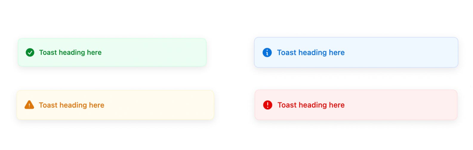
D. Adding custom action in the toast
 toast('Toast has been created', {
     action: {
       label: 'Undo'
       onClick: () => console.log('Undo')
     },
 })
E. Changing toast positions
Sonner gives us the ability to change the position of toasts easily by setting the
positionprop as the required position during initialization<Toaster position="top-left" />positioncan take one of the 6 values from "top-left", "top-center", "top-right", "bottom-left", "bottom-center", and "bottom-right".Handling multiple notifications
Sonner handles multiple simultaneous toasts in 2 ways - Expanding or Stacking(default)
we can change the behavior to expand by setting theexpandprops astruein initialization.<Toaster expand={true} />

Conclusion
There is a lot more stuff in Sonner, you can check Sonner's documentation and their official demo on the website. Let me know what libraries you use in your projects and let me how you like my blog and what stuff you want to write more about.
Thank you for reading this blog 🙏, I hope this blog added to your knowledge.
Leave a comment 📩
And Don't forget to Drop a 💖